Intro Wall

Team: Paolo Catalla, Jennifer Barrett, Alex Poterek

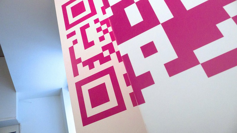
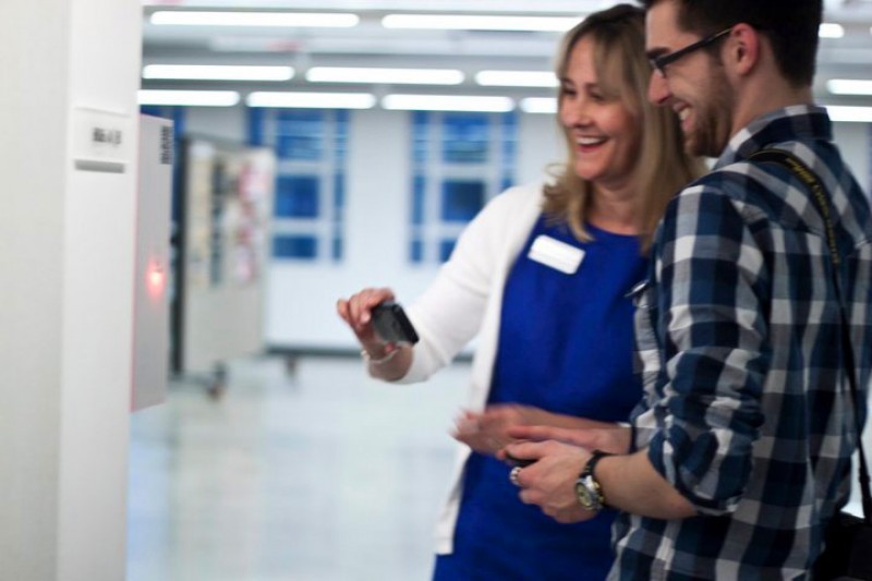
Because it was likely to be something visitors hadn’t experienced before, one of the key challenges was to quickly communicate our idea, and get people to participate. We wanted to make sure that visitors would understand that the QR codes they were seeing throughout the show weren’t just decoration, but had a function. Because our audience was coming to an art opening to have fun and attend a party, their expectation was to be social, casually peruse the artwork, and consume food and drink. So our goal was to engage visitors without overwhelming them with too much information. The solution we arrived at was a signage design near the entrance to the show, which could both educate and demonstrate the concept for the installation. This would enable users to recognize the work throughout the show. (In the end, we found the most successful introduction to the idea was often simply through watching other people interact!) This wall signage also established the visual identity for the work, as well as provided the first chance to interact, via the accompanying Interactive Windows.

The vinyl signage was a challenge to apply, with very fine detail and 3 sections to align.

Codes From Space from Nevercool on Vimeo.

Interactive Windows

Team: Alex Poterek, Paolo Catalla

windows_mobile

This team worked through a few iterations, working from a desire to create an interactive projection on existing architecture. The team eventually arrived at an idea that would utilize a grid of windows on the ground floor of the Taubman Center.

The Interactive Windows was the first piece visitors would see as they arrived at the Taubman Center for the Student Exhibition Opening. The installation was located at the front of the Detroit Creative Corridor Center, who were kind enough to permit us to house a large short-throw projector, the Galaxy Warp 5000. In turn, the team dedicated part of the piece to an exploration of the the organization’s identity and mission statement.

Interactive Windows from Nevercool on Vimeo.
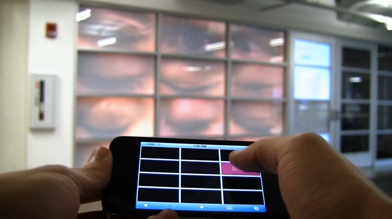
Because the clients are all connected, the experience is multiuser; each user can see all other users on their own mobile screen. Photos and screens from the Colada and Pixel Pix are also sent to the Interactive Windows for display in the grid. The interface is a web application built using Javascript and CSS, optimized for the mobile screen. The display application uses Adobe Flash in combination with widgets from the NETLab Toolkit, a project from Philip Van Allen at the New Ecology of Things Lab at Art Center College in Pasadena.

The piece may be reinstalled for a DC3 event in September, more updates later.

Zigzag Wall

Team: Lani Kercado, Cate Horn, Brian Hendrickson

p1000891_52_800

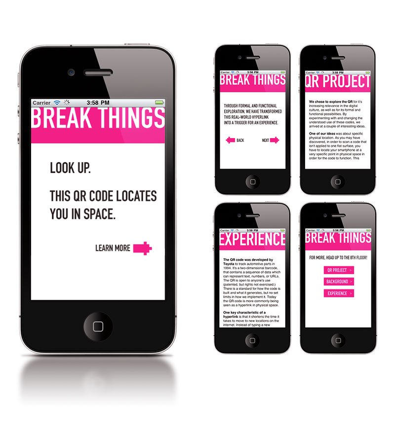
In early stages of the exploration, we discovered that a QR code could still function when it was “broken” or mapped onto multiple planes. Furthermore, we discovered that the code mapped in this way required the user to be located in a very specific space in order to scan it, because the perspective would only be correct from one position. This team used this idea of a broken plane to locate the user in space, and to highlight the spirit of the project. The mobile component also used the opportunity to explain some background on the overall project.

zigzag_mobile_design

Zigzag Wall from Nevercool on Vimeo.

Large scale prototypes were built, and in the process the team discovered there was a fair amount of accurate measurement and math required to get things right. Seemingly small miscalculations would result in a skewed or misaligned code, which would then be unrecognizable to the scanning software. After several conceptual iterations at different scales, the team concluded that the lines of sight required for the large-scale piece would be difficult to accommodate in the available spaces for the show. Space was at a premium, so the resulting solution was a more modular and smaller scale piece to suit a variety of possible spaces and sight lines.

Trial & Error

Team: Rachel Ariyavatkul, Paolo Catalla

trialerror_closeup

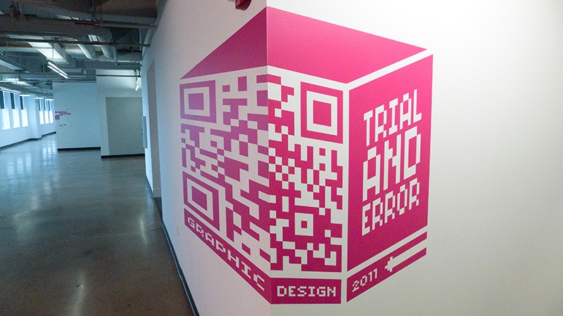
This unusual vinyl signage is a QR code mapped onto multiple planes in perspective, so that it can only be scanned from a particular spot. This locates the user directly between two other pieces of the installation, the Colada and Color Cubed. Upon successful scanning of this code, visitors arrive at a screen where they can choose to interact with either one. The effect of walking past the signage is unique, as message and form are revealed gradually.

Trial & Error signage from Nevercool on Vimeo.

The prototyping process was exacting. Projected images had to be marked, measured, and then transformed in Illustrator to precise measurements. QR has some error correction built in when things are flat… but when the code gets mapped to more than one plane, we discovered that the proportions must be accurate.

QR code prototyping from Nevercool on Vimeo.

Colada

Team: Will Ruby, Rachel Ariavatkul, Amanda Matzenbach

colada_closeup1_800

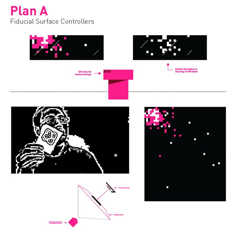
This team was interested in creating a kind of collaborative visualizer with the mobile device as controller. Initially, research was focused on creating an interaction using the fidiucial markers used by the Reactivision project. This prototype allowed the user to scan the QR, which would link to a URL that would display a graphic marker on the user’s mobile device, which could then be placed on a transparent surface in front of a camera. Using computer vision, the system could then track orientation of the mobile device, and allow the user to interact with the projected visuals.

colada_plan_a_800

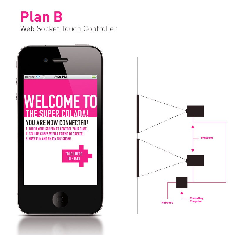
While this solution was both novel and functional, the speed of the interaction was limited by the frame rate of the camera/tracking software, and in testing it seemed that the interaction might be difficult for users to adapt to in a short time frame. The final prototype instead used a web application with a touch interface, which proved to be both immediately responsive and intuitive for the user.

colada_design2_800

Several iterations of the visual interaction were prototyped; some more game-like, some more abstract. The final implementation is a physics-driven system of generative visuals. When users’ markers collide on screen, persistent geometry is generated based on velocity and proximity, encouraging multi-user collaboration.

SEO Colada Documentation from Will Ruby on Vimeo.

Cube3

Team: Brian Jacob, Aileen Klebba, Brian Hendrickson

This team latched onto concept of the link between physical and virtual. This led to interaction with physical objects and spaces using virtual controls. A perfect fit for prototype work, the Arduino microncontroller was chosen as the actuator for these networked devices.

Initial concepts included electronic wayfinding via sound and light, collaborative interaction, and image capture. The team finally arrived at the concept of a “family” of Arduino-controlled devices called Cube3: a group of three plexiglass enclosures, each with a unique function.


Pixel Pix

pixelpix_closeup

Pixel Pix simulates the experience of being famous. The user scans the QR on the outside of the cube, and activates it via the mobile device. The cube then captures a photo with a unique visual twist, uses an algorithm to alter it, and sends it back to the mobile device in its “pixelated” form.


Pixel Pix from Nevercool on Vimeo.

These photos are then saved and become part of the grid of Interactive Windows on the first floor. Visitors to the show can see their photos on the way out!
 

One to One

So how do you scan the code on your own phone? Find a friend! The QR is scanned, and a different QR is loaded to the mobile screen. The dilemma of how to scan this code is solved by another user with another mobile device, who in turn must also find a friend to scan the code that loads to their device. Make sense? Each completed stage is rewarded with a sound and light response. When the interaction is completed, the box responds with a celebratory song, the lights chase excitedly, and lifelong friendships are forged.

teamwork_kristin_brian2


Color Cubed

colorcube_dark1

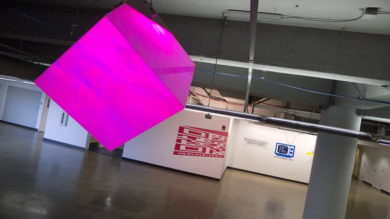
This piece gives the user a unique sense of control over their environment. In the bar/food/band area on the 8th floor, this team installed an internally-lit acrylic cube. The QR code links to an interface that allows the user to mix the color of the light. The cube itself runs on high powered LEDs and a wireless Xbee radio receiver hooked to an Arduino board. The multi-touch mobile interface allows the user to move three markers to control red, green and blue levels.


Trial & Error, Color Cubed from Nevercool on Vimeo.